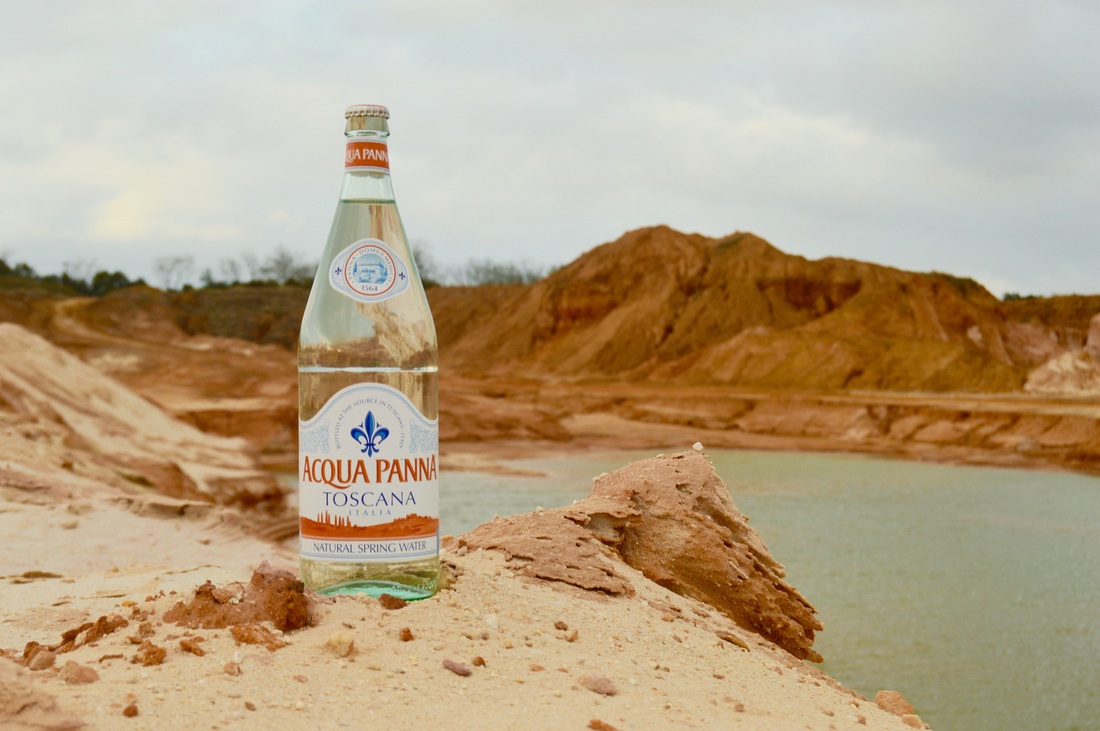
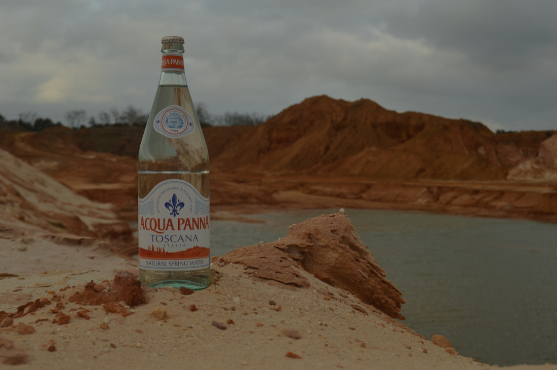
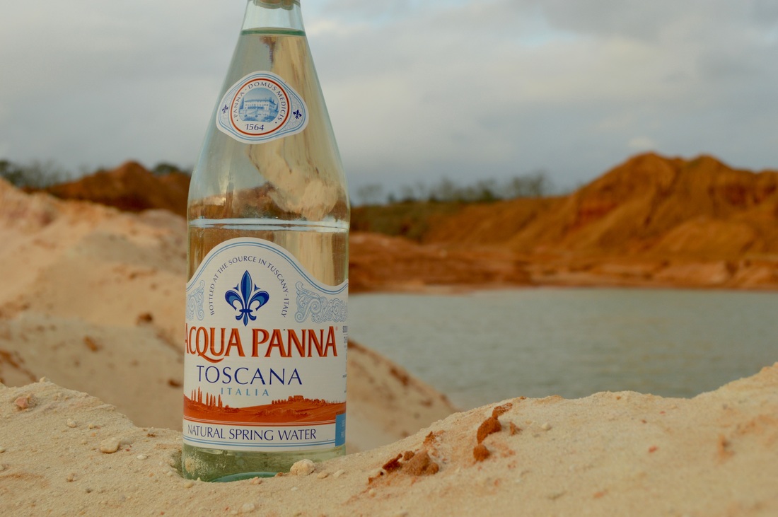
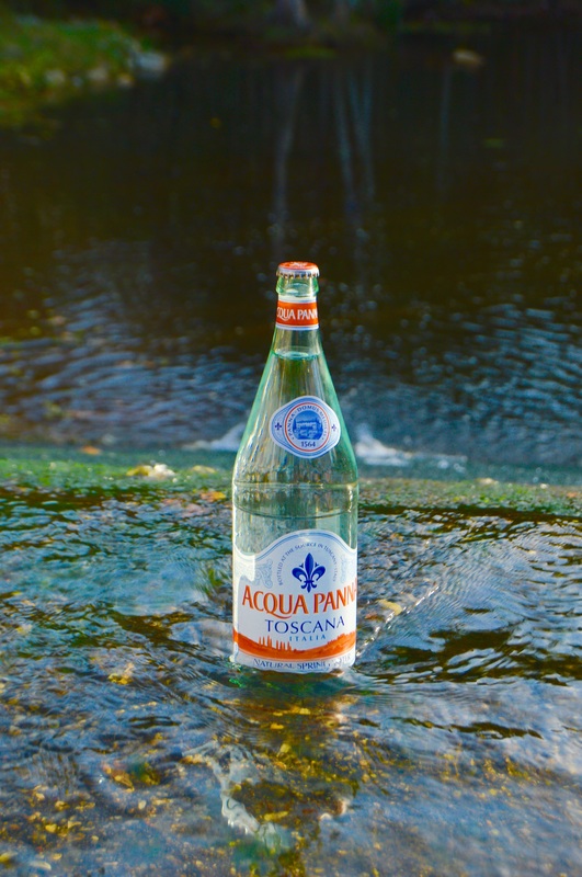
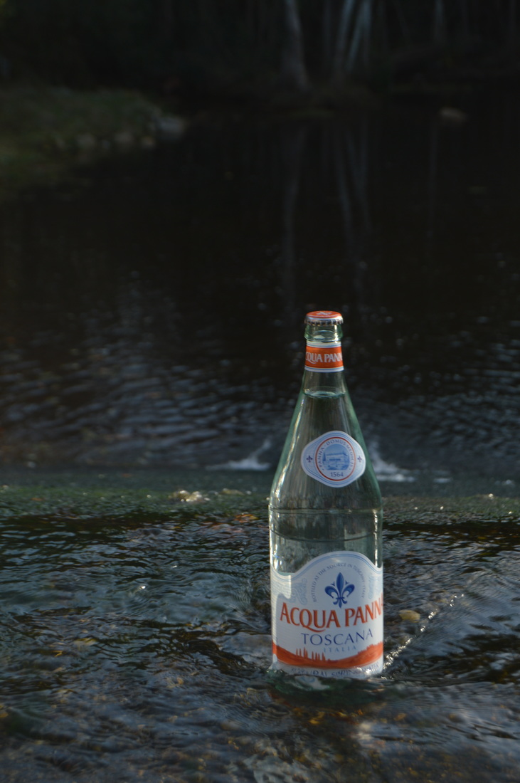
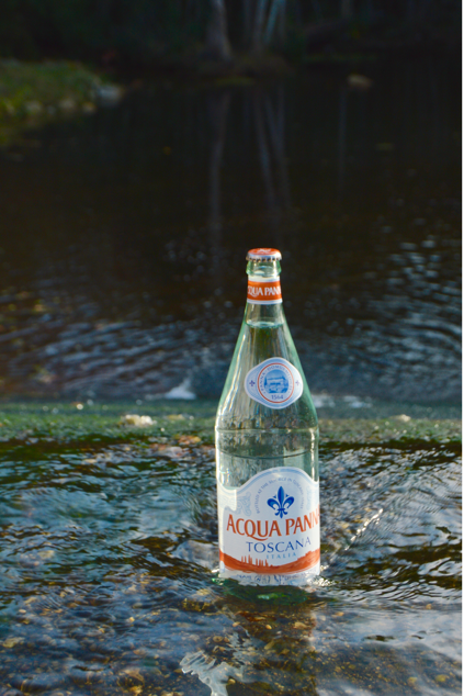
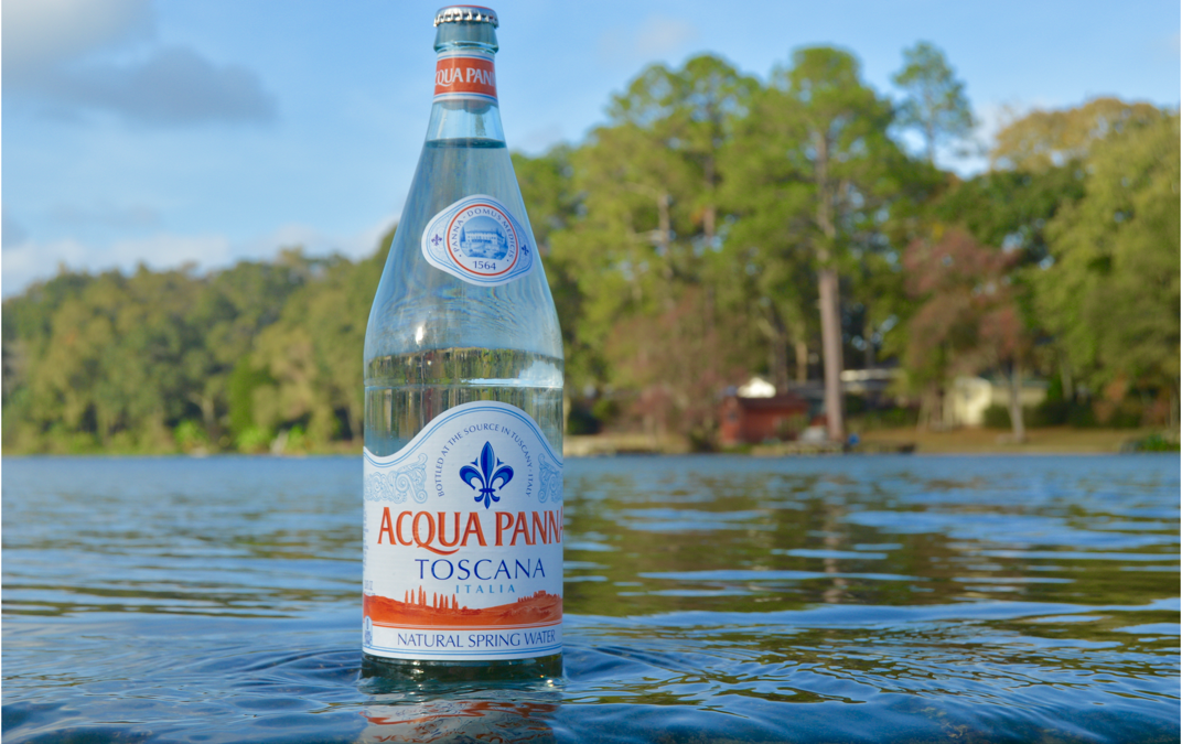
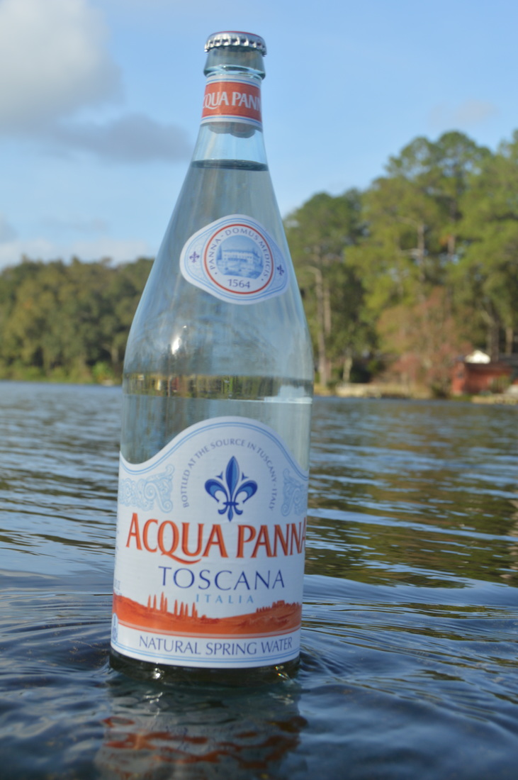
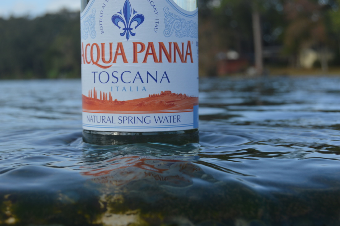
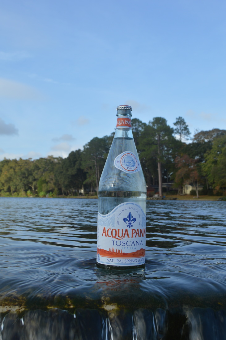
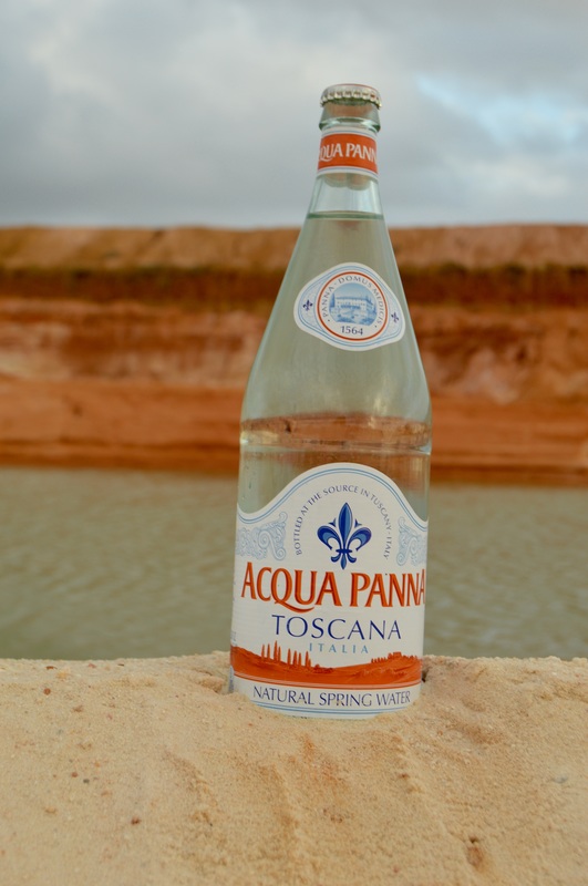
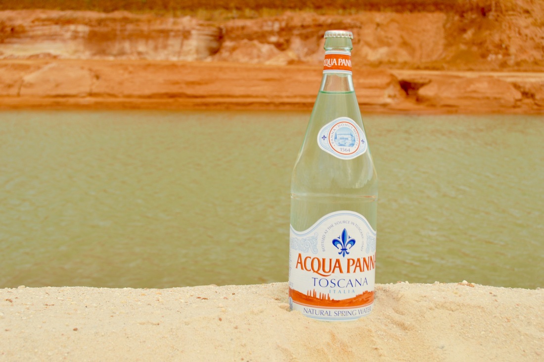
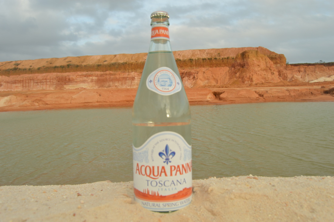
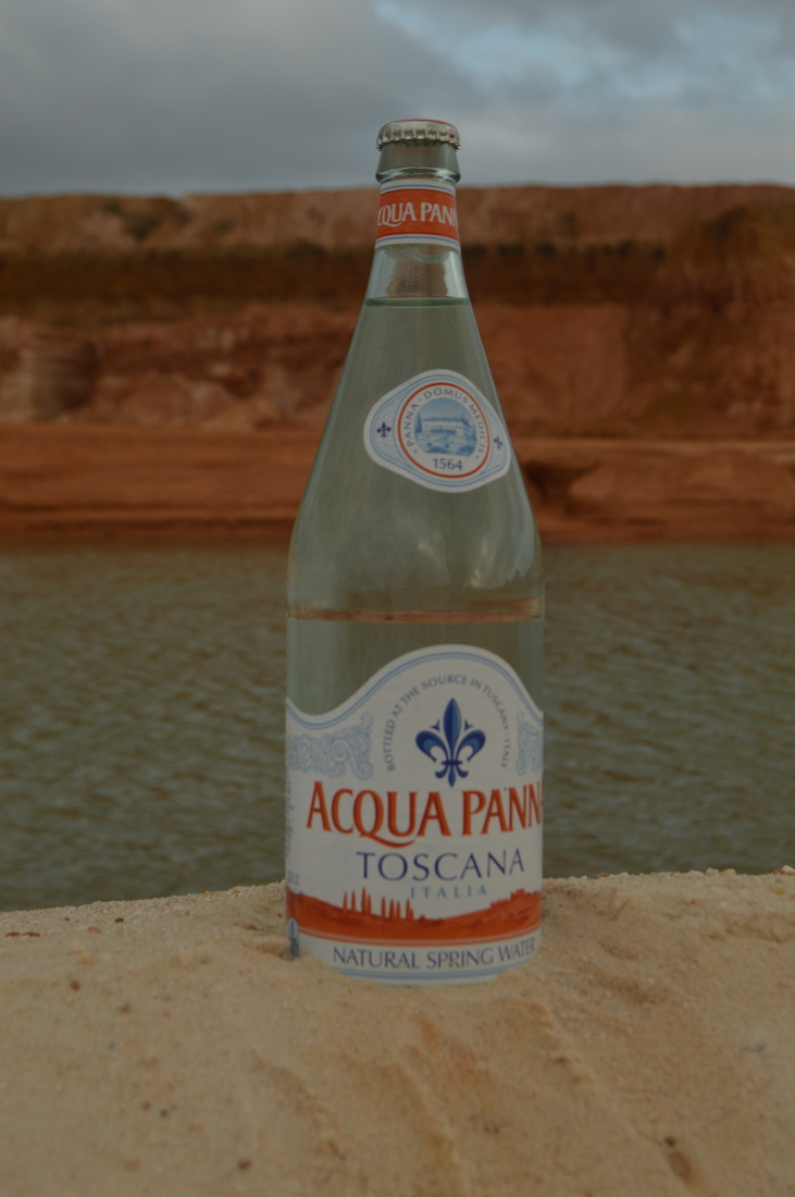
Intended Audience: I photographed spring water at a natural spring, so the intended audience would be people that prefer to buy and drink naturally filtered spring water. By placing the bottle in or near the water in the shots, it helps to get the point across; almost as if it's saying "I just bottled this water right here for you." The colors in the red clay match the color in the bottle as well, so it helps to link them, as if the colors on the bottle were based on the bottling site. So, again, it seems to suggest (or at least I think it does) that the water is being bottled at the places shown in the images. In my opinion, the site is pretty, so it adds more appeal. People like pretty things, so they may be more likely to buy a certain brand of product, like water, if they know it comes from someplace pretty.
 |  |  |
 |  |
 |  |  |
  |  |
